Lecture 4: More Pandas and Intro to Data Visualisations#
The Gapminder data set#
The Gapminder is a Swedish NGO whose mission is “to fight devastating ignorance with a fact-based worldview everyone can understand”. They provide data resources and highly engaging visualisations of the information in these data resources as can be seen in their webpages such as the bubles. In the examples below, we will use an extract of their data to learn more about Pandas DataFrame object.
Loading gapminder data set into a DataFrame#
From the class’ Canvas, you can download the gapminder.tsv file, which is a TAB delimited text file extracted from the gapminder database. The following codes demonstrate how to load this data file using Pandas’ .read_csv method, specifying that the delimiter character is a TAB character instead of a COMMA. Specifically, our code to load the gapminder.tsv file is:
import pandas as pd
gapminder_df = pd.read_csv('gapminder.tsv', sep='\t')
#%% The gapminder data
# Note: Materials below are adopted from Daniel Chen's book "Pandas for Everyone"
# (Have a browse of the book's github pages at: https://github.com/chendaniely/pandas_for_everyone#data)

# get the PANDAS module
import pandas as pd

# get the display method from IPython to use the command noninteractively
from IPython.display import display

# Loading the gapminder data;
# Note1: since gapminder.tsv is a tab separated file, we instruct .read_csv to use sep='\t' ('\t' is the tab character)
gapminder_df = pd.read_csv('gapminder.tsv', sep='\t')
A quick exploration of the gapminder data#
There are a number of Pandas DataFrame that allow us to view the content. Some of the commonly used ones are:
pd.head() allows to peek the first few rows of the DataFrame. The defaul is 5 rows, but you can specify the number of rows you want to peek.
pd.info() provides us with information on the contents of the DataFrame (column names, count of non-missing rows of each column, the data type of each column)
pd.describe() provides a univariate descriptive summaries of the numerical column (count, mean, std deviation, minimum, maximum and 25th, 50th and 75th percentile).
pd.shape reports the number of rows and columns (i.e. the shape) of the data frame.
pd.dtypes reports the object type of the columns.
pd.columns report a list of the column names.
For many more methods and properties and their use examples, see the essential functionality of pandas .
#%% exploring the Gapminder data

# get the PANDAS module
import pandas as pd

# get the display method from IPython to use the command noninteractively
from IPython.display import display

# Loading the gapminder data;
# Note1: since gapminder.tsv is a tab separated file, we instruct .read_csv to use sep='\t' ('\t' is the tab character)
gapminder_df = pd.read_csv('gapminder.tsv', sep='\t')
# .head() allows us to peek the first 5 rows of the dataframe
gapminder_df.head()

# peak the first 10 rows.
display(gapminder_df.head(10))

# we can also print() dataframe to quickly see the shape (i.e. dimension of the data)
print(gapminder_df)

# if we only need to know the shape (i.e. the number of rows and columns)
print(gapminder_df.shape) # the shape attribute of DataFrame

# Column names and the type of each column

print(gapminder_df.columns, '\n')
print(list(gapminder_df), '\n')
print(gapminder_df.dtypes, '\n')

# More information about the dataframe contents
print(gapminder_df.info(), '\n')
print(gapminder_df.describe(), '\n')
print(gapminder_df.continent.value_counts())
| country | continent | year | lifeExp | pop | gdpPercap | |
|---|---|---|---|---|---|---|
| 0 | Afghanistan | Asia | 1952 | 28.801 | 8425333 | 779.445314 |
| 1 | Afghanistan | Asia | 1957 | 30.332 | 9240934 | 820.853030 |
| 2 | Afghanistan | Asia | 1962 | 31.997 | 10267083 | 853.100710 |
| 3 | Afghanistan | Asia | 1967 | 34.020 | 11537966 | 836.197138 |
| 4 | Afghanistan | Asia | 1972 | 36.088 | 13079460 | 739.981106 |
| 5 | Afghanistan | Asia | 1977 | 38.438 | 14880372 | 786.113360 |
| 6 | Afghanistan | Asia | 1982 | 39.854 | 12881816 | 978.011439 |
| 7 | Afghanistan | Asia | 1987 | 40.822 | 13867957 | 852.395945 |
| 8 | Afghanistan | Asia | 1992 | 41.674 | 16317921 | 649.341395 |
| 9 | Afghanistan | Asia | 1997 | 41.763 | 22227415 | 635.341351 |
          country continent  year  lifeExp       pop   gdpPercap
0     Afghanistan      Asia  1952   28.801   8425333  779.445314
1     Afghanistan      Asia  1957   30.332   9240934  820.853030
2     Afghanistan      Asia  1962   31.997  10267083  853.100710
3     Afghanistan      Asia  1967   34.020  11537966  836.197138
4     Afghanistan      Asia  1972   36.088  13079460  739.981106
...           ...       ...   ...      ...       ...         ...
1699     Zimbabwe    Africa  1987   62.351   9216418  706.157306
1700     Zimbabwe    Africa  1992   60.377  10704340  693.420786
1701     Zimbabwe    Africa  1997   46.809  11404948  792.449960
1702     Zimbabwe    Africa  2002   39.989  11926563  672.038623
1703     Zimbabwe    Africa  2007   43.487  12311143  469.709298

[1704 rows x 6 columns]
(1704, 6)
Index(['country', 'continent', 'year', 'lifeExp', 'pop', 'gdpPercap'], dtype='object')

['country', 'continent', 'year', 'lifeExp', 'pop', 'gdpPercap']

country       object
continent     object
year           int64
lifeExp      float64
pop            int64
gdpPercap    float64
dtype: object

<class 'pandas.core.frame.DataFrame'>
RangeIndex: 1704 entries, 0 to 1703
Data columns (total 6 columns):
 #   Column     Non-Null Count  Dtype
---  ------     --------------  -----
 0   country    1704 non-null   object
 1   continent  1704 non-null   object
 2   year       1704 non-null   int64
 3   lifeExp    1704 non-null   float64
 4   pop        1704 non-null   int64
 5   gdpPercap  1704 non-null   float64
dtypes: float64(2), int64(2), object(2)
memory usage: 80.0+ KB
None

             year      lifeExp           pop      gdpPercap
count  1704.00000  1704.000000  1.704000e+03    1704.000000
mean   1979.50000    59.474439  2.960121e+07    7215.327081
std      17.26533    12.917107  1.061579e+08    9857.454543
min    1952.00000    23.599000  6.001100e+04     241.165876
25%    1965.75000    48.198000  2.793664e+06    1202.060309
50%    1979.50000    60.712500  7.023596e+06    3531.846988
75%    1993.25000    70.845500  1.958522e+07    9325.462346
max    2007.00000    82.603000  1.318683e+09  113523.132900

continent
Africa      624
Asia        396
Europe      360
Americas    300
Oceania      24
Name: count, dtype: int64
Selecting and subsetting columns#
We can select columns in a DataFrame using the column names or using the dot notation (effectively treating the column as a property of the DataFrame).
Selecting columns by name
Single column:
country = gapminder_df['country']Multi columns:
subset_df = gapminder_df[['country', 'continent', 'year']]
Selecting by dot notation:
country2 = gapminder_df.country
Note
If selecting a DataFrame column by name, then the name must be provided as a string object. To select multiple columns, then the names of the columns must be specified as a list of column names where each column name is a string object.
Note
If a single column is selected, then Pandas will return a Pandas Series object. If multiple columns are slected, we will get a DataFrame object
#%% Selecting and subsetting columns
# get the PANDAS module
import pandas as pd

# Loading the gapminder data;
gapminder_df = pd.read_csv('gapminder.tsv', sep='\t')

#By name: Single column:
country = gapminder_df['country']

#By name multi columns (use a [list-of-columns])
subset_df = gapminder_df[['country', 'continent', 'year']]

#Note: If a single column is selected, Pandas will return a Series;
#for multi columns, we will get a DataFrame
print(type(country))
print(type(subset_df))

#By dot notation (treating the columns as DataFrame attributes)
country2 = gapminder_df.country

print(country.head())
print(country2.head())
<class 'pandas.core.series.Series'>
<class 'pandas.core.frame.DataFrame'>
0    Afghanistan
1    Afghanistan
2    Afghanistan
3    Afghanistan
4    Afghanistan
Name: country, dtype: object
0    Afghanistan
1    Afghanistan
2    Afghanistan
3    Afghanistan
4    Afghanistan
Name: country, dtype: object
Selecting and subsetting rows with row names and indices#
There are several ways to select a DataFrame subset by rows based on the names of the row (as shown in the Index column) or the underlying row positive and negative indexing:
By index label (row name): .loc[]. For example,
print(gapminder_df.loc[0])will print the row with index label (or row name) = 0.By row index (row number): .iloc[]. For example,
print(gapminder_df.iloc[0])will print the first row (which is row 0 since Python list is 0 based). We can also use negative indexing. For example,print(gapminder_df.iloc[-1])will print the last row of the gapminder_df DataFrame.We can also use row index to extract multiple rows. For example, to get the first, 100th, and 1000th rows, we specify a list of the row indexes to be extracted:
print(gapminder_df.iloc[[0,99,999]])We can also select rows using the range() functions.
Note
.loc[] does not use index position. So this statement will produce an error message: print(gapminder_df.loc[-1])
# get the PANDAS module
import pandas as pd

# load gapminder data file
gapminder_df = pd.read_csv('gapminder.tsv', sep='\t')

# peek the first five rows
print(gapminder_df.head())

# print the first row of the DataFrame using row's name (which is shown by the "Index" column)
print("The contents of the first row of gapminder_df are", gapminder_df.loc[0])

# print the first row of the DataFrame using row's underlying positive index (this is similar to the underlying index of a string or list object)
print("The contents of the first row of gapminder_df are", gapminder_df.iloc[0])

# printing the last row of gapminder_df using negative indexing
print("The contents of the last row of gapminder_df are", gapminder_df.iloc[-1])

# printing multiple rows by specifying a list of the row indices
print("The contents of the 1st, 100th, and 1000th rows of gapminder_df are\n", gapminder_df.iloc[[0,99,999]])

# create a range of rows 0 to 4 (inclusive) and use it to select gapminder_df rows
row_range = list(range(5))
print(row_range)
gapminder_subset = gapminder_df.iloc[row_range]
print("The first five rows of gapminder_df", gapminder_subset)
       country continent  year  lifeExp       pop   gdpPercap
0  Afghanistan      Asia  1952   28.801   8425333  779.445314
1  Afghanistan      Asia  1957   30.332   9240934  820.853030
2  Afghanistan      Asia  1962   31.997  10267083  853.100710
3  Afghanistan      Asia  1967   34.020  11537966  836.197138
4  Afghanistan      Asia  1972   36.088  13079460  739.981106
The contents of the first row of gapminder_df are country      Afghanistan
continent           Asia
year                1952
lifeExp           28.801
pop              8425333
gdpPercap     779.445314
Name: 0, dtype: object
The contents of the first row of gapminder_df are country      Afghanistan
continent           Asia
year                1952
lifeExp           28.801
pop              8425333
gdpPercap     779.445314
Name: 0, dtype: object
The contents of the last row of gapminder_df are country        Zimbabwe
continent        Africa
year               2007
lifeExp          43.487
pop            12311143
gdpPercap    469.709298
Name: 1703, dtype: object
The contents of the 1st, 100th, and 1000th rows of gapminder_df are
          country continent  year  lifeExp       pop    gdpPercap
0    Afghanistan      Asia  1952   28.801   8425333   779.445314
99    Bangladesh      Asia  1967   43.453  62821884   721.186086
999     Mongolia      Asia  1967   51.253   1149500  1226.041130
[0, 1, 2, 3, 4]
The first five rows of gapminder_df        country continent  year  lifeExp       pop   gdpPercap
0  Afghanistan      Asia  1952   28.801   8425333  779.445314
1  Afghanistan      Asia  1957   30.332   9240934  820.853030
2  Afghanistan      Asia  1962   31.997  10267083  853.100710
3  Afghanistan      Asia  1967   34.020  11537966  836.197138
4  Afghanistan      Asia  1972   36.088  13079460  739.981106
Subsetting and selecting rows with conditional statements#
A subset of a DataFrame’s rows can also be selected using the conditional statement:
Using
.locand conditional statement. For example,print(gapminder_df.loc[gapminder_df.country == 'Afghanistan'])will select and print rows where the value ofcountrycolumn isAfghanistan.Using Pandas Query. For example,
print(gapminder_df.query("country == 'Afghanistan'"))will also elect and print rows where the value ofcountrycolumn isAfghanistan.
# get the PANDAS module
import pandas as pd

# load gapminder data file
gapminder_df = pd.read_csv('gapminder.tsv', sep='\t')

# printing rows using conditional statement based on a column's value
afghan_df = gapminder_df.loc[gapminder_df.country == 'Afghanistan']
print("The contents of the rows of gapminder_df for 'Afghanistan' are\n", afghan_df)

# printing rows using conditional statement based on a column's value
afghan_df2 = gapminder_df.query("country == 'Afghanistan'")
print("The contents of the rows of gapminder_df for 'Afghanistan' are\n", afghan_df2)
The contents of the rows of gapminder_df for 'Afghanistan' are
         country continent  year  lifeExp       pop   gdpPercap
0   Afghanistan      Asia  1952   28.801   8425333  779.445314
1   Afghanistan      Asia  1957   30.332   9240934  820.853030
2   Afghanistan      Asia  1962   31.997  10267083  853.100710
3   Afghanistan      Asia  1967   34.020  11537966  836.197138
4   Afghanistan      Asia  1972   36.088  13079460  739.981106
5   Afghanistan      Asia  1977   38.438  14880372  786.113360
6   Afghanistan      Asia  1982   39.854  12881816  978.011439
7   Afghanistan      Asia  1987   40.822  13867957  852.395945
8   Afghanistan      Asia  1992   41.674  16317921  649.341395
9   Afghanistan      Asia  1997   41.763  22227415  635.341351
10  Afghanistan      Asia  2002   42.129  25268405  726.734055
11  Afghanistan      Asia  2007   43.828  31889923  974.580338
Slicing Pandas DataFrame#
Similar to when we are working with String or List objects, we can also slice DataFrame to create subsets. This is often useful when we want to create dataframe subsets programmatically. For example, if we want to get all rows and the first three columns of the gapminder_df, we can issue the following statements:
mycols = list(range(3))
subsetdf = gapminder_df.iloc[:, mycols]
print(subsetdf)
Another example, to select the 1st, 100th, and 1000th rows and the 1st, 4th and 6th columns: subsetdf = gapminder_df.iloc[[0,99,999], [0,3,5]].
# get the PANDAS module
import pandas as pd

# load gapminder data file
gapminder_df = pd.read_csv('gapminder.tsv', sep='\t')

# all rows in the first three columns of gapminder_df
mycols = list(range(3))
subsetdf = gapminder_df.iloc[:, mycols]
print(subsetdf)

print("The 1st, 100th, and 1000th rows and the 1st, 4th and 6th columns:\n", gapminder_df.iloc[[0,99,999], [0,3,5]])
          country continent  year
0     Afghanistan      Asia  1952
1     Afghanistan      Asia  1957
2     Afghanistan      Asia  1962
3     Afghanistan      Asia  1967
4     Afghanistan      Asia  1972
...           ...       ...   ...
1699     Zimbabwe    Africa  1987
1700     Zimbabwe    Africa  1992
1701     Zimbabwe    Africa  1997
1702     Zimbabwe    Africa  2002
1703     Zimbabwe    Africa  2007

[1704 rows x 3 columns]
The 1st, 100th, and 1000th rows and the 1st, 4th and 6th columns:
          country  lifeExp    gdpPercap
0    Afghanistan   28.801   779.445314
99    Bangladesh   43.453   721.186086
999     Mongolia   51.253  1226.041130
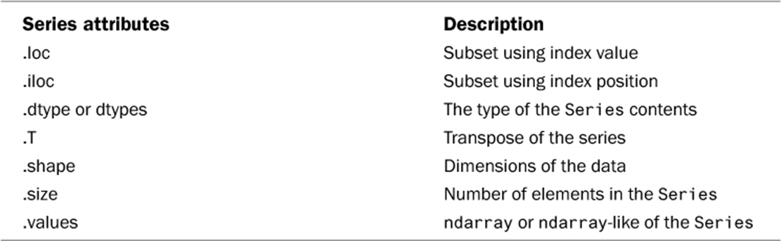
Pandas Series Object Attributes#
Below is summary of some Pandas Series Object attributes taken from Chen’s Pandas for everyone 2nd edition book.
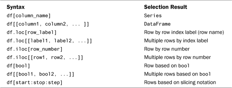
Subsetting DataFrame: A summary#
Below is summary of the different ways to select a subet of Pandas DataFrame taken from Chen’s Pandas for everyone 2nd edition book.
Grouped and Aggregated Calculation of DataFrame#
Let’s say we want to find out the average life expectancy across countries in each year recorded in the gapminder data set. How can we do that?
First, we need to “split” the
gapminder_dfinto yearly partsSecond, we need to get the life expectancy information which is in the ‘lifeExp’ column
Lastly, we need to compute the average.
The above steps can be translated into Python statement as follows:
Step1:
df.groupby('year')Step2:
df.groupby('year')['lifeExp']Step3:
df.groupby('year')['lifeExp'].mean()
# get the PANDAS module
import pandas as pd

# load gapminder data file
gapminder_df = pd.read_csv('gapminder.tsv', sep='\t')

print("Yearly average life expectancy")
yearlyavglifeexp = gapminder_df.groupby('year')['lifeExp'].mean()

print(type(yearlyavglifeexp))
print(yearlyavglifeexp)
Yearly average life expectancy
<class 'pandas.core.series.Series'>
year
1952    49.057620
1957    51.507401
1962    53.609249
1967    55.678290
1972    57.647386
1977    59.570157
1982    61.533197
1987    63.212613
1992    64.160338
1997    65.014676
2002    65.694923
2007    67.007423
Name: lifeExp, dtype: float64
Multiple group calculation#
Let’s say we now want to compute average life expectancy and income per capita both yearly and for each continent. This can be done by supplying a list of column names to groupby and a list of column names to compute the average:
df.groupby(['year', 'continent'])[['lifeExp', 'gdpPercap']].mean()
# get the PANDAS module
import pandas as pd

# load gapminder data file
gapminder_df = pd.read_csv('gapminder.tsv', sep='\t')

print("Yearly average life expectancy and GDP per capita by continent")
avggdplife= gapminder_df.groupby(['year', 'continent'])[['lifeExp','gdpPercap']].mean()
print(avggdplife)
Yearly average life expectancy and GDP per capita by continent
                  lifeExp     gdpPercap
year continent
1952 Africa     39.135500   1252.572466
     Americas   53.279840   4079.062552
     Asia       46.314394   5195.484004
     Europe     64.408500   5661.057435
     Oceania    69.255000  10298.085650
1957 Africa     41.266346   1385.236062
     Americas   55.960280   4616.043733
     Asia       49.318544   5787.732940
     Europe     66.703067   6963.012816
     Oceania    70.295000  11598.522455
1962 Africa     43.319442   1598.078825
     Americas   58.398760   4901.541870
     Asia       51.563223   5729.369625
     Europe     68.539233   8365.486814
     Oceania    71.085000  12696.452430
1967 Africa     45.334538   2050.363801
     Americas   60.410920   5668.253496
     Asia       54.663640   5971.173374
     Europe     69.737600  10143.823757
     Oceania    71.310000  14495.021790
1972 Africa     47.450942   2339.615674
     Americas   62.394920   6491.334139
     Asia       57.319269   8187.468699
     Europe     70.775033  12479.575246
     Oceania    71.910000  16417.333380
1977 Africa     49.580423   2585.938508
     Americas   64.391560   7352.007126
     Asia       59.610556   7791.314020
     Europe     71.937767  14283.979110
     Oceania    72.855000  17283.957605
1982 Africa     51.592865   2481.592960
     Americas   66.228840   7506.737088
     Asia       62.617939   7434.135157
     Europe     72.806400  15617.896551
     Oceania    74.290000  18554.709840
1987 Africa     53.344788   2282.668991
     Americas   68.090720   7793.400261
     Asia       64.851182   7608.226508
     Europe     73.642167  17214.310727
     Oceania    75.320000  20448.040160
1992 Africa     53.629577   2281.810333
     Americas   69.568360   8044.934406
     Asia       66.537212   8639.690248
     Europe     74.440100  17061.568084
     Oceania    76.945000  20894.045885
1997 Africa     53.598269   2378.759555
     Americas   71.150480   8889.300863
     Asia       68.020515   9834.093295
     Europe     75.505167  19076.781802
     Oceania    78.190000  24024.175170
2002 Africa     53.325231   2599.385159
     Americas   72.422040   9287.677107
     Asia       69.233879  10174.090397
     Europe     76.700600  21711.732422
     Oceania    79.740000  26938.778040
2007 Africa     54.806038   3089.032605
     Americas   73.608120  11003.031625
     Asia       70.728485  12473.026870
     Europe     77.648600  25054.481636
     Oceania    80.719500  29810.188275
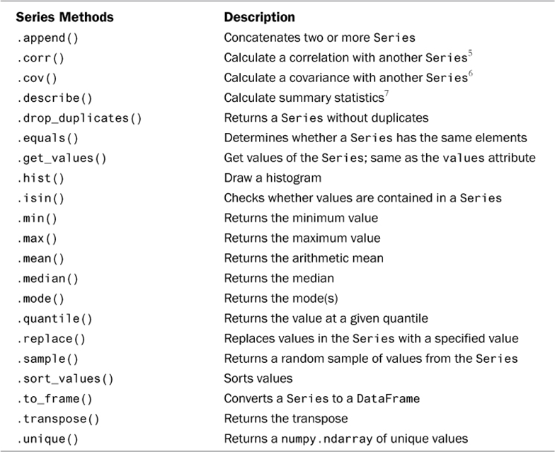
Pandas methods for groupby and aggregated calculation#
Below is summary of some Pandas Series methods for aggregated calcuation taken from Chen’s Pandas for everyone 2nd edition book.
Other examples of DataFrame operations#
Dropping Columns#
Sometimes, instead of selecting certain columns to create a subset of DataFrame, it is more convenient to drop columns. This could be done using the .drop() method of Pandas as shown in the example below.
#%% Dropping columns
scientists = pd.read_csv('scientists.csv')

# all the current columns in our data
print("Original list of columns:", scientists.columns)

# To drop the 'Age' column, you provide the axis=1 argument to drop column-wise
scientists_dropped=scientists.drop(['Age'], axis=1)

# columns after dropping our column
print("Remaining columns after 'Age' was dropped:",scientists_dropped.columns)
Original list of columns: Index(['Name', 'Born', 'Died', 'Age', 'Occupation'], dtype='object')
Remaining columns after 'Age' was dropped: Index(['Name', 'Born', 'Died', 'Occupation'], dtype='object')
Chaining DataFrame methods#
We can chain Pandas methods to apply several methods to a DataFrame in a single statement. Doing this can often make the codes look cleaner, more efficient, and easier to understand. Often, in doing data preprocessing tasks in data science, we chain methods in order to filter, sorting, or transform the data. The example below provides a method chaining illustration where we want to print the income records of persons who are older than 30 and display the result in descending order of the income.
Note
In the example, we enclose the chained method statement in (). This allows us to split the potentially long single chained method statement into multiple lines to improve readability.
#%% Chaining DataFrame methods
# ref: https://levelup.gitconnected.com/5-sneaky-pandas-secrets-for-data-wizards-that-make-you-10x-7dd65cbcbf6c
import pandas as pd

# Sample DataFrame
data = {'Name': ['John', 'Anna', 'Peter', 'Linda'],
        'Age': [28, 34, 45, 32],
        'Income': [50000, 60000, 80000, 75000]}
df = pd.DataFrame(data)
print("The original data\n", df)

# Method chaining example: Filtering and sorting data
result = (
    df
    .loc[df['Age'] > 30] # Filter rows where Age > 30
    .sort_values(by='Income', ascending=False) # Sort by Income in descending order
)

print("Age > 30, sort income column\n:", result)
The original data
     Name  Age  Income
0   John   28   50000
1   Anna   34   60000
2  Peter   45   80000
3  Linda   32   75000
Age > 30, sort income column
:     Name  Age  Income
2  Peter   45   80000
3  Linda   32   75000
1   Anna   34   60000
Another groupby example#
As discussed earlier, Pandas offer the groupby() method which allows us to “split” the DataFrame by aggregating the information (rows) based on one or more columns (or variables). This groupby operation allows us to gain additional insights from the data based on some summary measures. In essence, the groupby() method is a function to transform dataframe by splitting the data nto groups based on the category and thereafter uses some aggregation function such as sum() and mean() on each of the specified groups.
Below is another groupby example as an illustration. In this example, we create a DataFrame object which we store as ‘df’ and has two columns ([‘Category’, ‘Value’]) and 5 rows. The ‘Category’ column has two possible values: ‘A’ and ‘B’ and we want to aggregate the DataFrame by computing the sum of the column ‘Values’ by the group defined by ‘Category’ values. However, notice that in the example we do this by invoking the .sum() method in two ways. The first one as a DataFrame method and the second one as a Pandas Series method.
#%% Another example of groupby
# ref: https://levelup.gitconnected.com/5-sneaky-pandas-secrets-for-data-wizards-that-make-you-10x-7dd65cbcbf6c

import pandas as pd

# Sample data for GroupBy operation
data = {'Category': ['A', 'B', 'A', 'B', 'A'],
'Value': [10, 20, 30, 40, 50]}
df = pd.DataFrame(data)
print(df)

# Grouping data by 'Category' and calculating the sum of 'Value'
grouped_df = df.groupby('Category').sum()
print("Compute sum by Category")
print(grouped_df)
print(type(grouped_df))

# Grouping data by 'Category' and calculating the sum of 'Value'
grouped_series = df.groupby('Category')['Value'].sum()
print("Compute sum by Category")
print(grouped_series)
print(type(grouped_series))
  Category  Value
0        A     10
1        B     20
2        A     30
3        B     40
4        A     50
Compute sum by Category
          Value
Category
A            90
B            60
<class 'pandas.core.frame.DataFrame'>
Compute sum by Category
Category
A    90
B    60
Name: Value, dtype: int64
<class 'pandas.core.series.Series'>
Another example on applying custom functions#
As discussed before, we can use Pandas .apply() method to apply a function, element wise on a specified DataFrame or Series column. We can apply both built-in methods or functions or our own custom functions on the whole DataFrames or one dimension of a DataFrame- Series to perform complex transformations and computations in a row or column- efficient manner.
In the example below we show how the .apply() method can be applied to a DataFrame column to create a new column in the same DataFrame.
#%% A simple example to apply() custom function on dataframe
# ref: https://levelup.gitconnected.com/5-sneaky-pandas-secrets-for-data-wizards-that-make-you-10x-7dd65cbcbf6c
import pandas as pd

# Sample DataFrame
data = {'A': [1, 2, 3, 4],
'B': [5, 6, 7, 8]}
df = pd.DataFrame(data)

# Custom function to calculate the sum of squares
def sum_of_squares(x):
    return x**2

# Applying the custom function element-wise to column 'A'
df['Squared_A'] = df['A'].apply(sum_of_squares)
print(df)
   A  B  Squared_A
0  1  5          1
1  2  6          4
2  3  7          9
3  4  8         16
Identifying missing values#
It is often the case that the data we are working on contain missing values. Because some methods and functions in many different packages do not work properly unless missing values are correctly coded, we need to use Pandas’ isnull() and notnull() to identify missing values in DataFrames. This is illustrated in the following example.
First we create a DataFrame df which has two columns and each column has missing value(s) coded with a None object. Then we use .isnull() and .notnull() to count the number of missing values in each df’s column.
#%% Identifying missing values with isnull() and notnull()
# ref: https://levelup.gitconnected.com/5-sneaky-pandas-secrets-for-data-wizards-that-make-you-10x-7dd65cbcbf6c
import pandas as pd

# Sample DataFrame with missing values
data = {'A': [1, 2, None, 4],
'B': [5, None, None, 8]}
df = pd.DataFrame(data)
print(df)

# Count for for missing values and non-missing values
missing_values = df.isnull().sum()
print("Number of missing Values:")
print(missing_values)

nonmissing = df.notnull().sum()
print("Number of non-missing values")
print(nonmissing)
     A    B
0  1.0  5.0
1  2.0  NaN
2  NaN  NaN
3  4.0  8.0
Number of missing Values:
A    1
B    2
dtype: int64
Number of non-missing values
A    3
B    2
dtype: int64
Handling missing values#
Depending on the reasons for missing values, we may want to drop the rows containing missing values or replace the missing values with other values. For example, if the missing values can be assumed to mean the value of 0 or ‘No’, then we should replace the missing values with the expected value when a missing value is encountered. In other case, we may want to replace the missing value with an interpolated value (essentially, a guess of the expected value). In the example below we see the different ways in handling missing values.
#%% Handling missing values
# ref: https://levelup.gitconnected.com/5-sneaky-pandas-secrets-for-data-wizards-that-make-you-10x-7dd65cbcbf6c
import pandas as pd

# Sample DataFrame with missing values
data = {'A': [1, 2, None, 4],
'B': [5, None, None, 8]}
df = pd.DataFrame(data)
print(df)

# Fill missing values with a specified value
df_filled = df.fillna(0)
print("\nDataFrame with Missing Values Filled:")
print(df_filled)

# Drop rows with missing values
df_dropped = df.dropna()
print("\nDataFrame with Missing Values Dropped:")
print(df_dropped)
     A    B
0  1.0  5.0
1  2.0  NaN
2  NaN  NaN
3  4.0  8.0

DataFrame with Missing Values Filled:
     A    B
0  1.0  5.0
1  2.0  0.0
2  0.0  0.0
3  4.0  8.0

DataFrame with Missing Values Dropped:
     A    B
0  1.0  5.0
3  4.0  8.0
Data Visualisation#
Why visualise the data - The Anscombe’s Quartet#
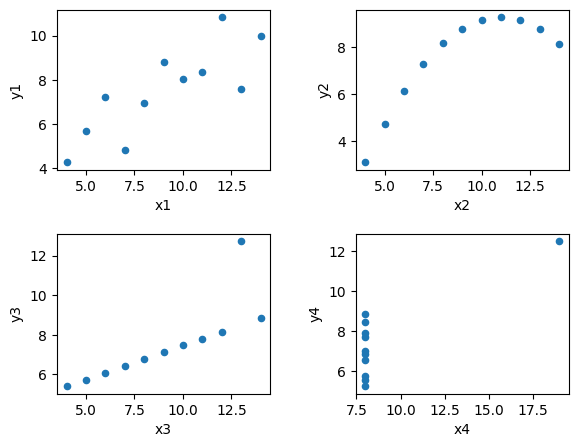
Let’s say we have four pairs of \((x, y)\) data: \((x_1, y_1)\), \((x_2, y_2)\), \((x_3, y_3)\), and \((x_4, y_4)\). Now, using the data, we compute the average values of each of \(x_i\) and \(y_i\), the sample variance, the correlation of each pair (i.e. between \(x_i\) and \(y_i\) for a given \(i\)), the linear regression equation of \((x_i, y_i)\), and the \(R^2\) of the linear regression. The results of these descriptive summaries of the four pairs of \((x_i,y_i)\) data are summarised in the table below:
Summary |
\((x_1, y_1)\) |
\((x_2, y_2)\) |
\((x_3, y_3)\) |
\((x_4, y_4)\) |
|---|---|---|---|---|
Mean of \(x_i\) |
9 |
9 |
9 |
9 |
Variance of \(x_i\) |
11 |
11 |
11 |
11 |
Mean of \(y_i\) |
7.5 |
7.5 |
7.5 |
7.5 |
Variance of \(y_i\) |
4.1 |
4.1 |
4.1 |
4.1 |
Correlation \((x_i,y_i)\) |
0.816 |
0.816 |
0.816 |
0.816 |
Fitted regression \(y_i\) on \(x_i\) |
\(y=3.0 + 0.5x\) |
\(y=3.0 + 0.5x\) |
\(y=3.0 + 0.5x\) |
\(y=3.0 + 0.5x\) |
Regression \(y_i\) on \(x_i\): \(R^2\) |
0.67 |
0.67 |
0.67 |
0.67 |
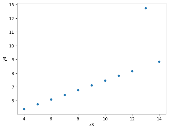
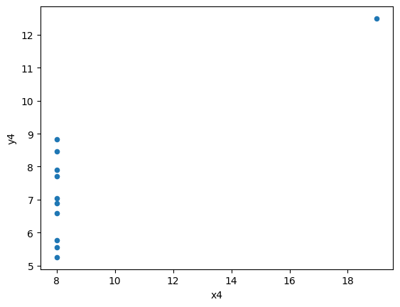
Therefore, we can conclude, even without looking at the actual data, that the four \((x_1, y_1)\), \((x_2, y_2)\), \((x_3, y_3)\), and \((x_4, y_4)\) pair data are identical. But, can we really make that conclusion?
Before we answer that, how about we see scatter plots of those four pairs of \((x_i,y_i)\) data. These scatter plots are shown below:
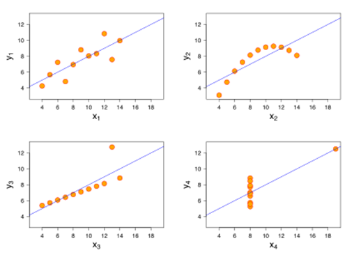
So, what happens here? It turns out the four pairs of \((x_i,y_i)\) data are not identical, despite of their “identical” univariate statistics. Because of data visualisation, we were able to have a more complete understanding of our data beyond statistical summaries can show.
You can read more on wikipedia about these Anscombe’s Quartet we just discussed.
Three Python data visualisation toolkits#
There are many Python data visualisation toolkits, but in this course we will only look at three of them:
Pandas’ built-in plotting capabilities
Matplotlib’s pyplot
Seaborn and Seaborn Object
The Matplotlib’s library is the perhaps the most-widely-used and general-purpose Python visualisation library and the most powerful. However, these advantages come with a cost of a higher complexity in terms of usage. Still, it is important to get to grips with this library, especially for fine-tuning our more complex data visualisation.
The Panda’s built-in plotting capabilities are developed on top of Matplotlib. What this means is that underneath Pandas’ plotting methods are Matplotlib functions, and thus the resulting plot can still be tweaked (and often as a requirement) using Matplotlib commands. These Pandas methods are easier to learn and use to create quick plots based on data in Pandas DataFrame with not much coding. Hence it is excellent for quick data exploration.
The Seaborn and Seaborn Objects are also developed on top of Matplotlib to provide easier to learn and use data visualisation. Unlike Pandas built-in plotting methods, Seaborn and, especially Seaborn Objects, make it even simpler to create complex and multilayer visualisation without much needs for fine tuning using Matplotlib commands.
Getting started in data visualisation#
How do we make good data visualisations? How do we generate data visualisations in Python? The answers to these questions will be guided by your data and the purpose of visualisation. Choosing a type of visualisation that suits these two factors is crucial. There are several factors that need to be considered:
Is the data qualitative or quantitative?
If quantitative, is it continuous or discrete?
What do we know about any inherent realtionships in the data and what do we want to know?
What is the dimensionality of the data?
We can, for example, choose the type of data visualisation by the function of the visualisation (i.e. what we want to shop with the visualisation). For examples:
To compare or contrast. In this case, we need data visualisation that can highlight similarities or differences in the data. For example, box plots.
To show composition. Here, we want data visualisations which can breakdown or subdivide the information contained in the data. For examples, using pie charts or stacked bars.
To describe distribution. Here, we need visuals that display how the data points are distributed (say over a range of values). For examples, histogram, kernel density, and violin plots.
To view relationship. For this, we want visuals that can illustrate connection and/or correlations. For example, scatter plot.
To see changes over time. In this case, we need visuals that can depict trends and evolution of the underlying data points over time. For example, line charts.
Scatter plot#
A scatter plot is a visual representation of any potential relationship between \(𝑥\) and \(𝑦\). Specifically, a scatter plot shows the coordinate points \((𝑥_𝑖, 𝑦_𝑖)\) for each row 𝑖 in the data set (e.g. in a Pandas DataFrame).
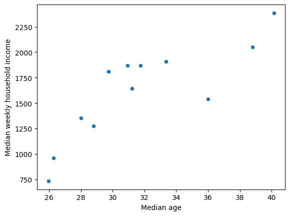
Using Panda’s method to generate a scatter plot#
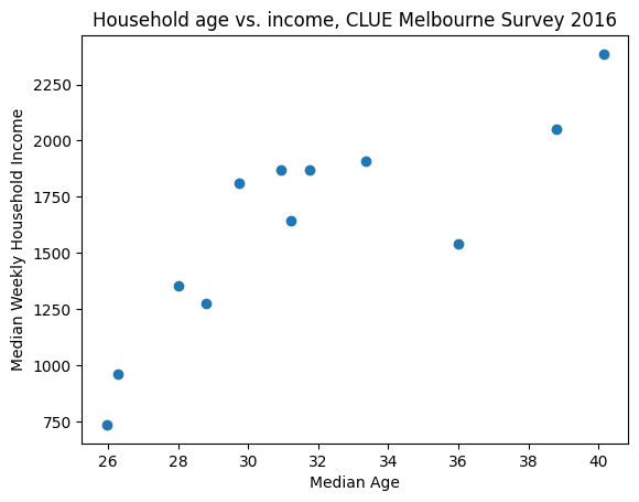
In the example below, we will generate a scatter plot based on data from the Melbourne’s CLUE survey. Specifically, we want to use a scatter plot to show the relationship between household age and income across Melbourne’s suburbs. The resulting scatter plot suggests a positive relationship between ‘Median weekly household income’ and ‘Median age’.
#%% Pandas' scatter plot method: Melbourne CLUE survey data

# get the PANDAS module
import pandas as pd

# get the display method from IPython to use the command noninteractively
from IPython.display import display

# CLUE data source: https://www.melbourne.vic.gov.au/clue-interactive-visualisation
# CLUE: Census of Land Use and Employment

clue_df1 = pd.read_csv('CLUE_age_vs_household_income_2016.csv')

display(clue_df1)

# Use panda's plot.scatter function to plot median age vs median weekly
# household income here

clue_df1.plot.scatter(x='Median age', y='Median weekly household income')
| geography | Median age | Median weekly household income | |
|---|---|---|---|
| 0 | Carlton | 25.97 | 734.71 |
| 1 | Docklands | 31.76 | 1870.17 |
| 2 | East Melbourne | 40.14 | 2386.03 |
| 3 | Greater Melbourne | 36.00 | 1542.00 |
| 4 | Kensington | 33.37 | 1909.37 |
| 5 | Melbourne (CBD) | 26.29 | 959.83 |
| 6 | City of Melbourne | 28.00 | 1354.00 |
| 7 | North Melbourne | 28.79 | 1275.52 |
| 8 | Parkville | 31.22 | 1642.33 |
| 9 | South Yarra (inc. Melbourne Remainder) | 38.79 | 2052.48 |
| 10 | Southbank | 30.93 | 1869.85 |
| 11 | West Melbourne (Residential) | 29.73 | 1811.24 |
<Axes: xlabel='Median age', ylabel='Median weekly household income'>
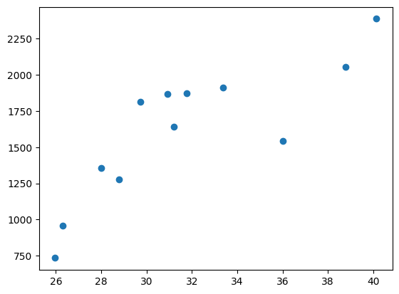
Generating scatter plot directly using Matplotlib’s pyplot#
Panda’s .plot() method is an abstraction of Matplotlib’s pyplot.scatter() function. This is because Pandas is built on top of NumPy (for numerical ops) and Matplotlib (for visualisation). The goal is to simplify the process to generate plots from a DataFrame. However, Matplotlib which is ported from and thus has similar capabilities to MATLAB’s plot, can be used directly. Using matplotlib directly allows for powerful control of the resulting plot.
To use matplotlib for scatter plot, we need to import the pyplot components as follows:
import matplotlib.pyplot as pl
The pl.scatter() function requires two arguments:
a vector of 𝑥 co-ordinates for the desired points
a vector of 𝑦 co-ordinates for the desired points These vectors can be passed as arrays, lists, dataframe columns, etc. as shown in the example below.
Note
Unlike Pandas pd.plot.scatter() plot, the pl.scatter() plot does not come with a default axis label. To add axis labels we need to add separate instructions. This approach of building a chart one component at a time using multiple separate instructions is called an imperative approach. This is in contrast to a declarative approach in which we use a single instruction to declare the chart to build.
#%% Scatter plot using matplotlib

import matplotlib.pyplot as pl

# read the CLUE data
clue_df1 = pd.read_csv('CLUE_age_vs_household_income_2016.csv')

# generate scatter plot using Matplotlib's pyplot()
pl.scatter(x=clue_df1['Median age'], y=clue_df1['Median weekly household income'])
<matplotlib.collections.PathCollection at 0x7f9df49e3dd0>
Matplotlib’s figure type object#
In the imperative approach of Matlotlib, a visualisation object is first created and this (such as a scatter plot) can contain many elements such as:
Axes and axes labels
Plotting area and plotted data itself, and more. Specifically, Matplotlib’s “figure” class is an object container of these visualisation elements.
We can initialise the figure object: pl.figure() (or let Python automatically initialise it on a plot command).
The figure object doesn’t look like much on its own.
Matplotlib commands populate the figure object with the specified visualisation elements (axes, plotted data, etc).
Once all plotting commands are complete, the visualisation which the figure object describes is rendered as a graphic
To tell Python that our plotting commands are complete we execute the command: `pl.show() or save()’
Note
When we execute a single cell in Spyder (or JupyterNotebook) with any figure, pl.show is automatically rendered and displayed if we only have a single ‘figure’ object created in the same cell.
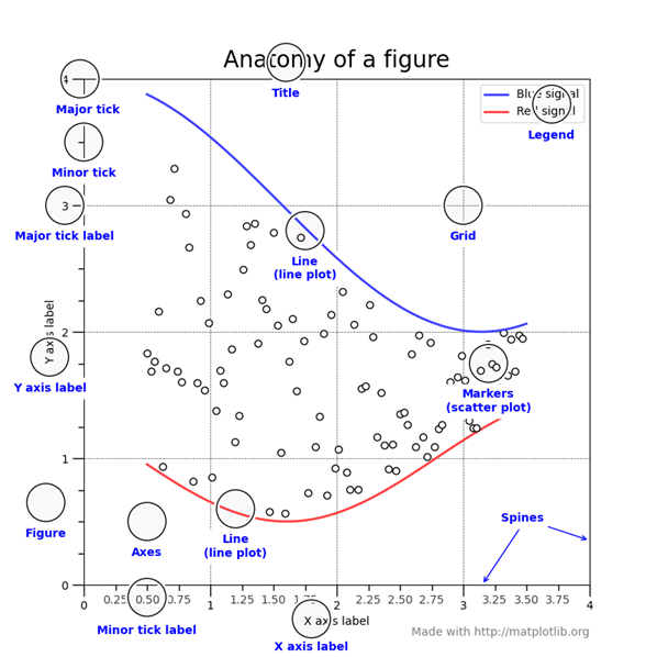
The following chart from shows the anatomy of a Matplotlib figure container and its elements for the case of the shown example (see matplotlib manual).
The example belows show how we use separate instructions to add more elements to the Matplotlib figure object which contains the previous scatter plot.
Note
We have not assigned any name to the figure object, but it exists in the memory and pyplot recognises it for us to use pyplot’s methods to add more elements into it.
#%% Working with "figure" container to add axes label to matplotlib scatter plot

# First, regenerate our scatter plot (and let python intialise a figure object
pl.scatter(x=clue_df1['Median age'], y=clue_df1['Median weekly household income'])

# Now, on the figure object (in the memory) we add labels.

pl.xlabel('Median Age')
pl.ylabel('Median Weekly Household Income')

# Addint title to the plot

pl.title('Household age vs. income, CLUE Melbourne Survey 2016');
Creating multiple plots and saving plots#
How can we create the multiplot of Anscombe’s Quartet data shown earlier? How to save our plots automatically to an external graphic file?
Remember that with Matplotlib, there is a figure object container underlying the generated plot. So, for example, to generate the Anscombe’s Quartet multiplot:
First, get the Anscombe’s Quarter data into DataFrames
Second, using Matplotlib to create a figure object as a container of four subplots
Third, use the DataFrame plot.scatter() or pyplot scatter() to create scatter plot of each pair \((x_i,y_i)\) data and put each of this plot into the figure container.
Then we can call Matplotlib figure object’s .savefig() method to save the multiplot. There are several file format to choose from to save the plot into including pdf, png, svg, and eps.
The example below shows how the Anscombe’s Quartet multiplot was generated and saved. First, we load the data into four DataFrames:
#%% Anscombe's quartet: 4 different series with identical summary
# statistics but look very different
#set Anscombe's Quartet as 4 dataframes
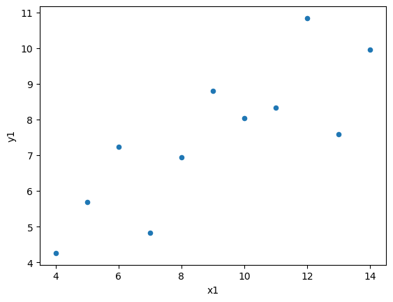
df1=pd.DataFrame(
{'x1':[10.0, 8.0, 13.0, 9.0, 11.0, 14.0, 6.0, 4.0, 12.0, 7.0, 5.0],
'y1':[8.04, 6.95, 7.58, 8.81, 8.33, 9.96, 7.24, 4.26, 10.84, 4.82, 5.68]
}
)
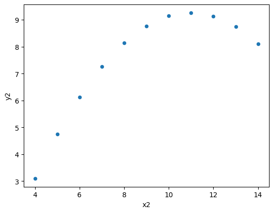
df2=pd.DataFrame(
{'x2':[10.0, 8.0, 13.0, 9.0, 11.0, 14.0, 6.0, 4.0, 12.0, 7.0, 5.0],
'y2':[9.14, 8.14, 8.74, 8.77, 9.26, 8.10, 6.13, 3.10, 9.13, 7.26, 4.74]
}
)
df3=pd.DataFrame(
{'x3':[10.0, 8.0, 13.0, 9.0, 11.0, 14.0, 6.0, 4.0, 12.0, 7.0, 5.0],
'y3':[7.46, 6.77, 12.74, 7.11, 7.81, 8.84, 6.08, 5.39, 8.15, 6.42, 5.73]
}
)
df4=pd.DataFrame(
{'x4':[8.0, 8.0, 8.0, 8.0, 8.0, 8.0, 8.0, 19.0, 8.0, 8.0, 8.0],
'y4':[6.58, 5.76, 7.71, 8.84, 8.47, 7.04, 5.25, 12.50, 5.56, 7.91, 6.89]
}
)
display(df1, df2, df3, df4)
| x1 | y1 | |
|---|---|---|
| 0 | 10.0 | 8.04 |
| 1 | 8.0 | 6.95 |
| 2 | 13.0 | 7.58 |
| 3 | 9.0 | 8.81 |
| 4 | 11.0 | 8.33 |
| 5 | 14.0 | 9.96 |
| 6 | 6.0 | 7.24 |
| 7 | 4.0 | 4.26 |
| 8 | 12.0 | 10.84 |
| 9 | 7.0 | 4.82 |
| 10 | 5.0 | 5.68 |
| x2 | y2 | |
|---|---|---|
| 0 | 10.0 | 9.14 |
| 1 | 8.0 | 8.14 |
| 2 | 13.0 | 8.74 |
| 3 | 9.0 | 8.77 |
| 4 | 11.0 | 9.26 |
| 5 | 14.0 | 8.10 |
| 6 | 6.0 | 6.13 |
| 7 | 4.0 | 3.10 |
| 8 | 12.0 | 9.13 |
| 9 | 7.0 | 7.26 |
| 10 | 5.0 | 4.74 |
| x3 | y3 | |
|---|---|---|
| 0 | 10.0 | 7.46 |
| 1 | 8.0 | 6.77 |
| 2 | 13.0 | 12.74 |
| 3 | 9.0 | 7.11 |
| 4 | 11.0 | 7.81 |
| 5 | 14.0 | 8.84 |
| 6 | 6.0 | 6.08 |
| 7 | 4.0 | 5.39 |
| 8 | 12.0 | 8.15 |
| 9 | 7.0 | 6.42 |
| 10 | 5.0 | 5.73 |
| x4 | y4 | |
|---|---|---|
| 0 | 8.0 | 6.58 |
| 1 | 8.0 | 5.76 |
| 2 | 8.0 | 7.71 |
| 3 | 8.0 | 8.84 |
| 4 | 8.0 | 8.47 |
| 5 | 8.0 | 7.04 |
| 6 | 8.0 | 5.25 |
| 7 | 19.0 | 12.50 |
| 8 | 8.0 | 5.56 |
| 9 | 8.0 | 7.91 |
| 10 | 8.0 | 6.89 |
Now we check and confirm that these four different data pairs of \((x_i,y_i)\) by producing mean and standard deviation.
#%% compare mean and standard deviation of the Anscombe Quartet data
print("")
print(F"Mean & std dev of x1 is {df1['x1'].mean():.2f} and {df1['x1'].std():.2f}")
print(F"Mean & std dev of x2 is {df2['x2'].mean():.2f} and {df2['x2'].std():.2f}")
print(F"Mean & std dev of x3 is {df3['x3'].mean():.2f} and {df3['x3'].std():.2f}")
print(F"Mean & std dev of x4 is {df4['x4'].mean():.2f} and {df4['x4'].std():.2f}")
print("")
print(F"Mean & std dev of y1 is {df1.y1.mean():.2f} and {df1.y1.std():.2f}")
print(F"Mean & std dev of y2 is {df2.y2.mean():.2f} and {df2.y2.std():.2f}")
print(F"Mean & std dev of y3 is {df3.y3.mean():.2f} and {df3.y3.std():.2f}")
print(F"Mean & std dev of y4 is {df4.y4.mean():.2f} and {df4.y4.std():.2f}")
Mean & std dev of x1 is 9.00 and 3.32
Mean & std dev of x2 is 9.00 and 3.32
Mean & std dev of x3 is 9.00 and 3.32
Mean & std dev of x4 is 9.00 and 3.32

Mean & std dev of y1 is 7.50 and 2.03
Mean & std dev of y2 is 7.50 and 2.03
Mean & std dev of y3 is 7.50 and 2.03
Mean & std dev of y4 is 7.50 and 2.03
Then, we create a figure container (which we name as fig) with 2x2 subplots using Matplotlib subplots() function. The specific subplot is assigned an object name called axes. After that, we create each of the four Anscombe’s Quartet plot using DataFrame .plot.scatter() method to which we supply the axes location within each subplot to the ax parameter of .plot.scatter() method. Lastly, we may need to adjust the spaces between subplots (through trial and error) and then save the multiplot by calling figure objects’ .savefig() method.
#%% multiple pandas plots in one figure

# we will put the four panda plots inside a matplotlib plot
import matplotlib.pyplot as plt

#since we have four plots, we set up a 2x2 subplots
fig, axes = plt.subplots(2, 2)

#now we re-do the scatter plot, speciying the subplot position for each plot
df1.plot.scatter(ax=axes[0,0], x='x1', y='y1')
df2.plot.scatter(ax=axes[0,1], x='x2', y='y2')
df3.plot.scatter(ax=axes[1,0], x='x3', y='y3')
df4.plot.scatter(ax=axes[1,1], x='x4', y='y4')

#we might need to adjust the default "spaces" between subplots
#the values we set are the fractions of the width and heights of the subplots
plt.subplots_adjust(left=0.1,
                    bottom=0.1,
                    right=0.9,
                    top=0.9,
                    wspace=0.4,
                    hspace=0.4)

fig.savefig('xyplot.svg')
Working with the figure container from DataFrame’s .plot() method#
The example below shows how we can work with the figure container directly when we create a scatter plot using Pandas DataFrame’s plot method. In this case, from DataFrame .plot() method we chain it with the .get_figure() method. In the example, we assign a different name for each of the figure object created. We can then call the .savefig() method to save each of the plot.
Note
If you run the codes in Spyder, since the full path for the saved file location is not specified, the resulting files are put in Spyder’s working directory (specified in top right hand corner of the Spyder IDE window).
#%% scatter plots of (x, y) in each dataframe
#basic command
df1.plot.scatter(x='x1', y='y1')

# if we want to save the plot automatically, we work with the figure container
# for example, we can use the get_figure() method to access the figure object
xyplot1fig = df1.plot(kind='scatter', x='x1', y='y1').get_figure()

# Save figure in various file format
xyplot1fig.savefig('xyplot1.pdf') #Adobe PDF
xyplot1fig.savefig('xyplot1.png') #Portable network graph (good for web)
xyplot1fig.savefig('xyplot1.svg') #Scalable vector graph (good if you want to resize)

#let's plot the rest
#notice we can save directly without assigning the figure object to a variable
df2.plot.scatter(x='x2', y='y2').get_figure().savefig('xyplot2.svg')
df3.plot.scatter(x='x3', y='y3').get_figure().savefig('xyplot3.svg')
df4.plot.scatter(x='x4', y='y4').get_figure().savefig('xyplot4.svg')
Introducing Seaborn#
While Matplotlib is very powerful and versatile, it comes with a significant cost in terms of the complexity to learn and use when more complex multilayered plots are required. Other criticisms on Matplotlib include:
Matplotlib’s defaults were based on MATLAB circa 1999 (which means archaic)
Matplotlib’s API is relatively low level; It is tricky to do sophisticated statistical visualization
Matplotlib predated Pandas by more than a decade (not designed specifically for use with Pandas DataFrames)
The added plotting capabilities of Pandas which are built on top of Matplotlib simplify the call to Matplotlib plotting functions. However, Pandas simplified set of commands require a change in the approach from Matplotlib’s imperative approach, in which chart elements are added by separate instruction, to a declarative approach which specifies the chart we want including all its elements in one single instruction. This mean the declarative command for a complex chart can be quite unwieldly and it is often the case that we will still need to use Matplotlib’s command to extend Pandas’ plotting command for creating more complex plots.
Now, comes seaborn, a Python statistical data visualisation which provides an API on top of Matplotlib and is designed to counter the limitations of Pandas’ limited and simple plotting capabilities while at the same time still has the power of many Matplotlib functions but with a much simpler declarative approach. It is “a Python data visualization library based on matplotlib. It provides a high-level interface for drawing attractive and informative statistical graphics.” Seaborn provides:
More sane choices for plot style and colour defaults,
Simpler high-level functions for common statistical plot types,
Integration with the functional capabilities provided by Pandas DataFrames. In short, searborn is designed to be as simple as Pandas’ plot and still as powerful as Matplotlib.
Seaborn plotting functions#
For a full list of functions and how to use, see Seaborn’s API reference and tutorials.
Seaborn’s greatest strengths is in its diversity and simplicity of plotting functions.
To use seaborn, there are two ways to supply plotting data:
First (the recommended way) is to pass DataFrame to the data= argument; and pass column names to the axes arguments (say, x= and y=).
The second way is to directly pass Series to the axes arguments.
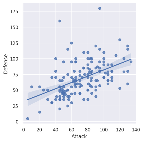
The example below shows how to create a scatter plot using seaborn’s .lmplot() function. In the example, we use seaborn’s default theme and the ‘darkgrid’ style. For the plot example, we use a pokemon characters’ attribute data. In this case, we want to produce a scatter plot of Pokemon attack and defense rating.
Note
Seaborn’s lmplot() function produces a scatter plot AND a linear regression fit line with confidence interval. There are parameters to turn some elements on and off.
#%% Introducing seaborn
# Visual exploration of pokemon dataset
# Ref: https://elitedatascience.com/python-seaborn-tutorial#step-6

import matplotlib.pyplot as plt
import numpy as np
import pandas as pd
import seaborn as sns

# use default theme by calling .set_theme() without any argument
sns.set_theme()

# use darkgrid aesthetic
sns.set_style('darkgrid')

# Read dataset
pokemon_df = pd.read_csv('Pokemon.csv', index_col=0, encoding='latin')
pokemon_df.head()

#let's produce a scatter plot of Pokemon attack and defense rating
#note: the lmplot produces a scatter plot AND a linear regression fit line
#with confidence interval

sns.lmplot(x='Attack', y='Defense', data=pokemon_df)
<seaborn.axisgrid.FacetGrid at 0x7f9de4bae720>
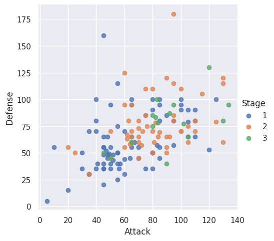
Customising lmplot via its parameters#
The example below shows how we can remove the regression line from seaborn’s lmplot()’s output and add a third dimension on the chart to be shown as hue color associated with Pokemon character’s stage of evolution (i.e. Pokemon’s “age”). Also, we show that underlying the seaborn’s lmplot() output is still our old friend Matplotlib’s figure object as the container of the plot. This is because seaborn is just an API on top of Matplotlib which simplifies how we access Matplotlib’s functions. Hence, we can use Matplotlib pyplot’s .savefig method to save the resulting seaborn lmplot’s output.
#%% scatter plot without regression line

# Scatterplot arguments
sns.lmplot(x='Attack', y='Defense', data=pokemon_df,
           fit_reg=False, # No regression line
           hue='Stage')   # Color by evolution stage

plt.savefig('pokemonscat.svg')
Customising seaborn outputs using Matplotlib functions#
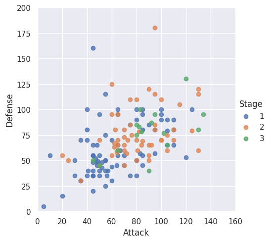
Given that seaborn is essentially a high-level interfact to Matplotlib, we can use Matplotlib commands to customise the plots produce by our seaborn calls. This low level access to direct Matplotlib commands can be especially useful if there is no exact seaborn function’s parameters to achieve what we want. In the example below, we use Matplotlib pyplot’s xlim and ylim to set the axes value range of a plot produced by seaborn lmplot.
#%% Customizing seaborn plots with matplotlib commands

sns.lmplot(x='Attack', y='Defense', data=pokemon_df,
           fit_reg=False,
           hue='Stage')

# Tweak using Matplotlib
plt.ylim(0, 200)
plt.xlim(0, 160)
(0.0, 160.0)
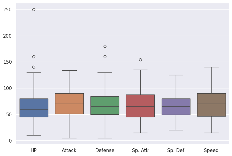
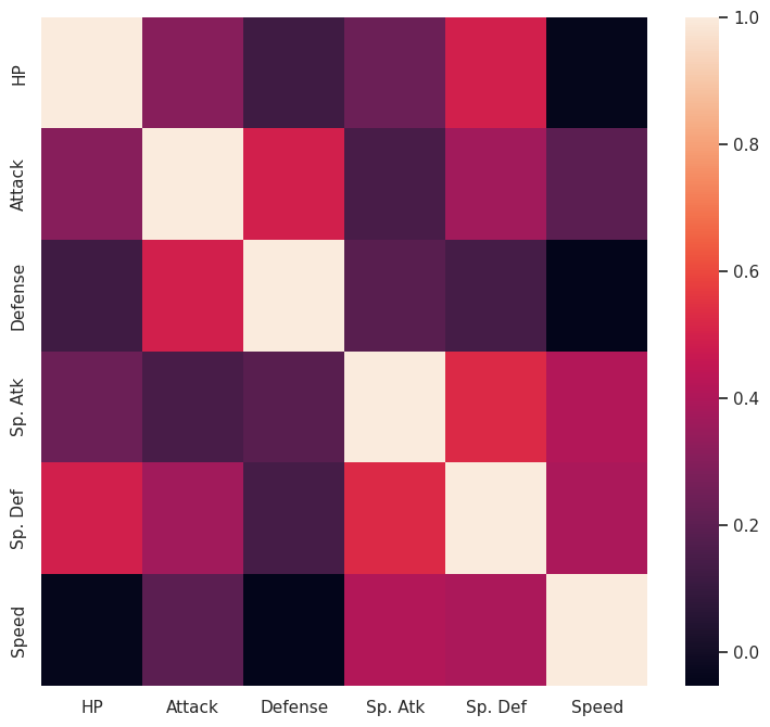
In the next two examples, we show how to create a plot with multiple boxplots and a heatmap using seaborn functions. This seaborn gallery shows many different types of plots that seaborn API simplifies from their relevant Matplotlib’s commands. Notice in the examples we also use direct Matplotlib commands to set the size of the figure container.
#%% Multiple boxplots for the distribution of combat stats

# Preprocess DataFrame to explore only the individual combat "stats"
# (so we drop non-combat stats (stage and legendary) and total stats)
stats_df = pokemon_df.drop(['Name', 'Type 1', 'Type 2', 'Total', 'Stage', 'Legendary'], axis=1)

# New boxplot using stats_df
plt.figure(figsize=(9,6)) # Set plot dimensions
sns.boxplot(data=stats_df)

#%% Correlation between different combat stats shown using heatmap

# Calculate correlations
corr = stats_df.corr()

# Heatmap
plt.figure(figsize=(9,8))
sns.heatmap(corr)
<Axes: >
Distribution plots using seaborn#
In the next set of examples, we illustrate how we an use seaborn to generate plots to visualise distribution of the underlying data using histogram and kernel density plots. These examples are adapted from the github website of the Python Data Science Handbook by Jake VanderPlas.
Note
Some of the seaborn functions in this example have been deprecated and you may receive a warning and an instruction on how to modify your code to use a replacement function
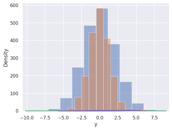
#%% Histogram plot: Here we overlay two histograms of two jointly distributied
# random normal variable
import matplotlib.pyplot as plt
import numpy as np
import pandas as pd
import seaborn as sns
sns.set()
sns.set_style('darkgrid')
#generate 2000 random draw from 2-dimension multivariate normal distribution with
#mean [0,0] and cov[[5,2],[2,2]]
randomxy = np.random.multivariate_normal([0, 0], [[5, 2], [2, 2]], size=2000)
#the np command above returns an ndarray; we want to put them into a DataFrame
randomxy_df = pd.DataFrame(randomxy, columns=['x', 'y'])
for col in 'xy':
plt.hist(randomxy_df[col], density=False, alpha=0.5)
#%% Instead of histogram, we can plot the kernel density estimate using
# Seaborn's sns.kdeplot:
for col in 'xy':
sns.kdeplot(randomxy_df[col], shade=True)
#%% We can overlay the histogram and kde plots using sns.displot()
sns.distplot(randomxy_df['x'])
sns.distplot(randomxy_df['y'])
#%% Two dimensional plot of the jointly distributed random variables X and Y
sns.kdeplot(data=randomxy_df, x='x', y='y')
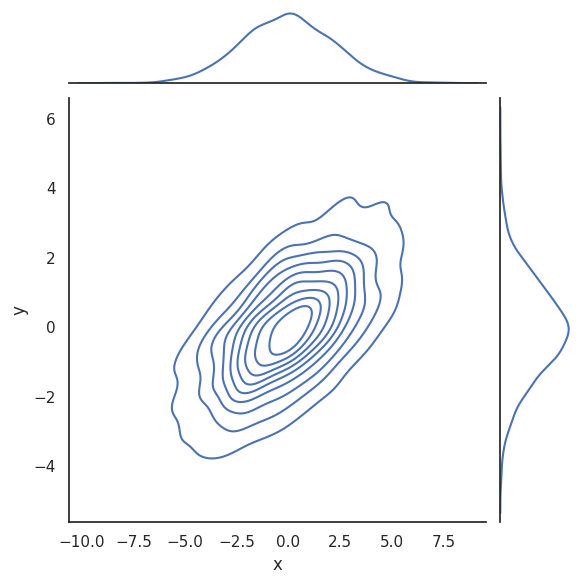
#%% sns.jointplot KDE
# Plot joint distribution and the marginal distributions together
#margin shown as KDE plot
with sns.axes_style('white'):
sns.jointplot(data=randomxy_df, x="x", y="y", kind='kde');
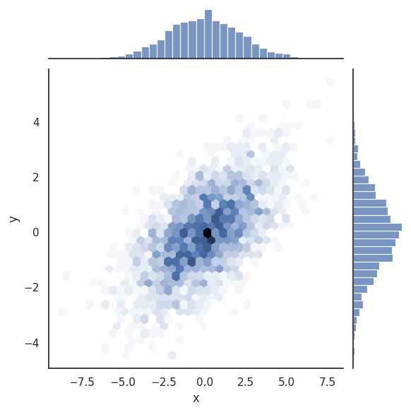
#%% sns.jointplot histogram
# Plot joint distribution and the marginal distributions together
#margin shown as histogram plot
with sns.axes_style('white'):
sns.jointplot(data=randomxy_df, x="x", y="y", kind='hex');
/tmp/ipykernel_17730/1132498324.py:25: FutureWarning:

`shade` is now deprecated in favor of `fill`; setting `fill=True`.
This will become an error in seaborn v0.14.0; please update your code.

  sns.kdeplot(randomxy_df[col], shade=True)
/tmp/ipykernel_17730/1132498324.py:25: FutureWarning:

`shade` is now deprecated in favor of `fill`; setting `fill=True`.
This will become an error in seaborn v0.14.0; please update your code.

  sns.kdeplot(randomxy_df[col], shade=True)
/tmp/ipykernel_17730/1132498324.py:29: UserWarning:

`distplot` is a deprecated function and will be removed in seaborn v0.14.0.

Please adapt your code to use either `displot` (a figure-level function with
similar flexibility) or `histplot` (an axes-level function for histograms).

For a guide to updating your code to use the new functions, please see
https://gist.github.com/mwaskom/de44147ed2974457ad6372750bbe5751

  sns.distplot(randomxy_df['x'])
/tmp/ipykernel_17730/1132498324.py:30: UserWarning:

`distplot` is a deprecated function and will be removed in seaborn v0.14.0.

Please adapt your code to use either `displot` (a figure-level function with
similar flexibility) or `histplot` (an axes-level function for histograms).

For a guide to updating your code to use the new functions, please see
https://gist.github.com/mwaskom/de44147ed2974457ad6372750bbe5751

  sns.distplot(randomxy_df['y'])
Seaborn’s pair and facet plots#
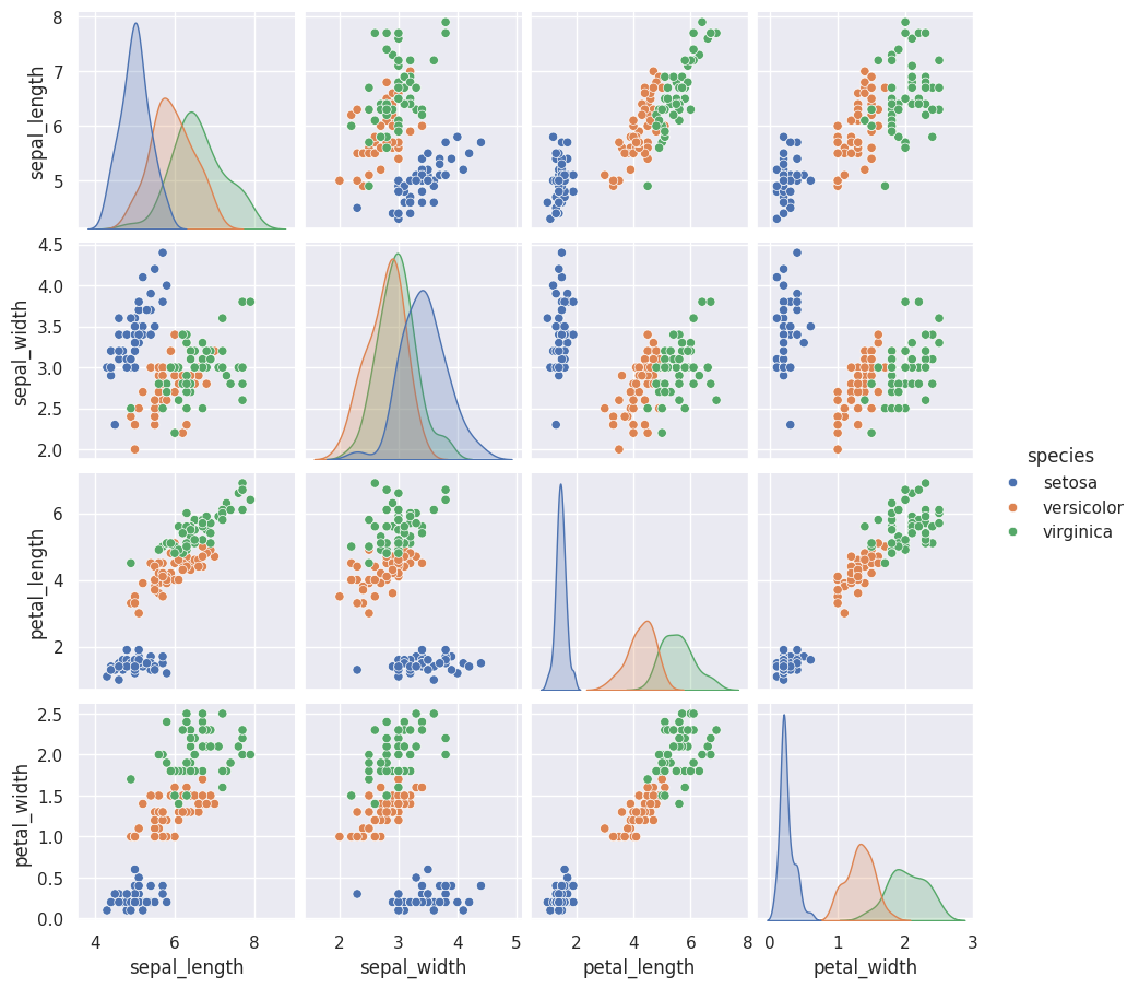
The following examples show how to quickly display the relationships between any possible pair of variables (i.e. columns) in the DataFrame and how to create multiplot. In these examples we use two data sets that come with seaborn installation, namely: the iris data set and the tips data set. For more details, see seaborn-data on github.
#%% Exploring correlations using pair plots
# First load the well-known Iris dataset thatcomes with seaborn
# The dataset lists measurements of petals and sepals of three iris species:
iris = sns.load_dataset("iris")
# convert inf value to na
#iris.replace([np.inf, -np.inf], np.nan, inplace=True)
#show a few rows of the data
iris.head()
# Now visualise the multidimensional relationships using sns.pairplot
sns.pairplot(iris, hue='species', height=2.3)
plt.savefig('iris.svg')
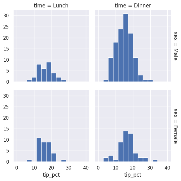
#%% Multi histogram plots
tips = sns.load_dataset('tips')
tips.head()
tips['tip_pct'] = 100 * tips['tip'] / tips['total_bill']
grid = sns.FacetGrid(tips, row="sex", col="time", margin_titles=True)
grid.map(plt.hist, "tip_pct", bins=np.linspace(0, 40, 15))
<seaborn.axisgrid.FacetGrid at 0x7f9ddeaba2a0>
Using seaborn’s theme with Matplotlib command#
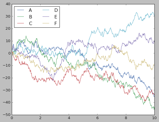
The following example shows that, if we want to for some reasons, we can use seaborn’s visual aesthetics for plots that we generate directly with Matplotlib commands. In the example, we plot a hypothetically generated time series known as random walks.
A random walk function can be defined as follows: If a time series \(𝑦(𝑡)\) is a random walk then it must be true that: \(𝑦(𝑡) = 𝑦(𝑡−1) + 𝑟𝑎𝑛𝑑𝑜𝑚𝑒𝑟𝑟𝑜𝑟\)
The specific python codes to generate this (source):
import numpy as np

#use 0 as the seed for random number generator
rng = np.random.RandomState(0)

#x is an array of size 500 of equally spaced interval values from 0 to 10
x = np.linspace(0, 10, 500)

#y is an array of size 5x500 of cumulative sum of random values from standard normal distribution
y = np.cumsum(rng.randn(500, 6), 0)
# first import the required modules
import matplotlib.pyplot as plt
plt.style.use('classic')
import numpy as np
import pandas as pd
# Let's generate some artificial random walk series for us to plot
# Note: A time series y is a random walk if y(t) = y(t-1) + randomerror
#use 0 as the seed for random number generator
rng = np.random.RandomState(0)
#x is an array of size 500 of equally spaced interval values from 0 to 10
x = np.linspace(0, 10, 500)
#y is an array of size 5x500 of cumulative sum of random values from
#standard normal distribution
y = np.cumsum(rng.randn(500, 6), 0)
# Using matplotlib defaults Create line plots of the random data we have generated
plt.plot(x, y)
plt.legend('ABCDEF', ncol=2, loc='upper left')
plt.savefig('cumsum1.svg')
plt.show()
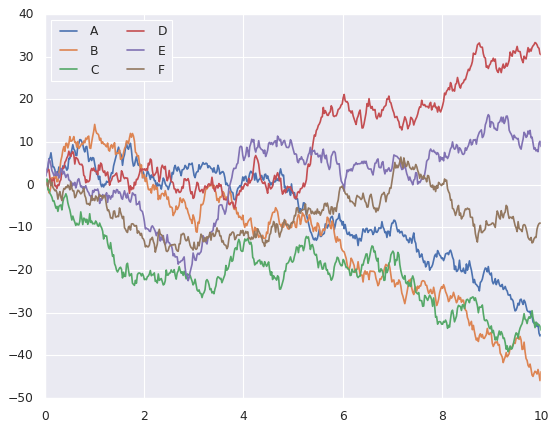
#Now let's see how seaborn plots the same random walks
import seaborn as sns
sns.set_theme()
#setting seaborn theme
#there are 6 themes: see https://seaborn.pydata.org/tutorial/aesthetics.html#seaborn-figure-styles)
sns.set_style('darkgrid')
#using the same plotting code as above!
plt.plot(x, y)
plt.legend('ABCDEF', ncol=2, loc='upper left')
plt.savefig('cumsum2.svg')
plt.show()
Seaborn Objects#
While the seaborn examples above show the simplicity and power of the seaborn API to Matplotlib to quickly generate complex plots relatively easily, we can also see that more advanced visualisations with multilayered plots from multi data sources can still be challenging to produce. Often, we may still need to use direct Matplotlib commands for advanced formatting (which may not be easy to learn). Furthermore, the declarative approach of seaborn makes it necessary to have many different declarative plotting functions, each for specific charts. For example, we need barplot(), boxplot(), lineplot(), and scatterplot() functions to create these different types of visualisations. These different functions can be challenging to learn and use when they come with different sets of parameters to specify to get the complex custom plots we need.
Because of the above limitations, we now introduce the seaborn objects (so). First, of all, with seaborn object, all plot types can be produced with one function: Plot(). As shown in the image below, so.Plot() replaces the many different seaborn plot functions().
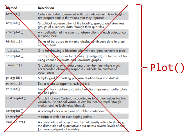
For more details, see https://seaborn.pydata.org/tutorial/objects_interface.html.
Steps to visualisation using Seaborn Objects#
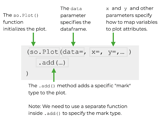
We can think of a Seaborn Object as similar to Matplotlib’s figure object container, except that in this case, instead of adding a figure element such as axis label, figure title, etc., we can add Seaborn plots. Thus, the steps to create data visualisation using the Seaborn Objects are as follows:
Use the
so.Plot()function to initialise the Seaborn Object plotting.
Specify the DataFrame object that you want to use as containing the underlying data to plot.
Map the DataFrame’s columns to the aesthetic attributes of the plot (e.g., the x- and y-axes)
Use Seaborn Object’s
.add()method to specify the “mark” that you want to draw in the Seaborn Object plotting container. For example, we specify dots as mark if we want to add scatter plots and lines as mark if we want to add line plot.
Syntax of Seaborn Objects#
The syntax for using Seaborn Objects is illustrated in the following diagram:
The so.Plot() method#
The so.Plot() function must be called to initialise plotting with Seaborn Object. If we don’t supply any additional parameters to so.Plot(), then we will get an empty plot as shown in the following example codes.
#%% Initialising plot with so.Plot()
import seaborn as sns
import seaborn.objects as so

# initialising a blank Seaborn Object
so.Plot()
The parameters for so.Plot()#
The so.Plot() function take parameters for Data and Mappings (plotting the marks). Some of the most important parameters include:
The data parameter: specify the DataFrame containing the data to plot. Note: you can also specify NumPy arrays or other array-like objects instead of DataFrame.
The x and y parameters: to specify the part of the data to plot to be used as the x- and y-axes. If the data parameter is a DataFrame, then the x- and y-parameters are specified as column name(s) in the DataFrame.
The colour parameter: to specify the colour of the marks.
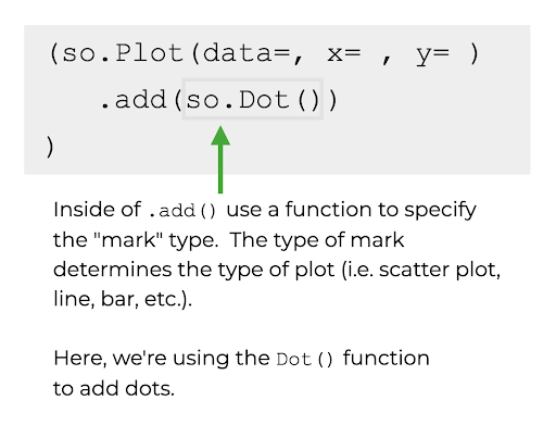
Adding marks to so.Plot() object#
To add different types of plots into the Seaborn Object, we call the .add() method, specifying the correct “marks” for the type of plot we want. The diagram) below illustrates how to specify the dot mark using so.Dot() method to add a scatter plot:
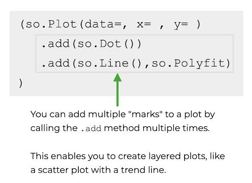
Adding multiple layers to so.Plot() object#
We can repeat specifying more .add() method with appropriate “marks” to add more layer into the same plot container defined by the so.Plot() object. This is shown in the [diagram] below (ttps://anaconda.cloud/seaborn-objects-system). Note: by default, all layers will use the data-to-parameter mappings specified in the so.Plot() call. However, it is possible to override those mappings inside of a particular layer.
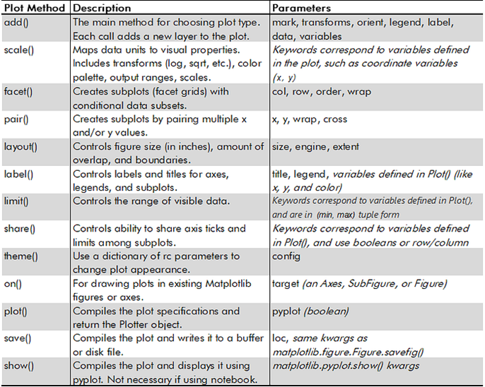
The SO’s Plot() class comes with many methods for specifying marks, scale data, faceted or paired subplots, figure dimensions, labels, and saving plots, etc. These are listed in the following diagrams.
and
Examples of creating plots with Seaborn Objects#
Using SO to create scatter plot#
In the first example below, we illustrate how to create a simple scatter plot using Seaborn Object interface (i.e. so.Plot()). Notice that to allow for breaking the so.Plot() statements which could be very long, we wrap it inside a parantheses:
(so.Plot()
)
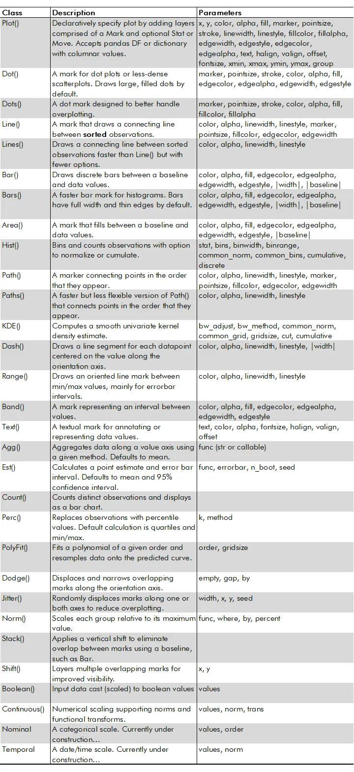
This allows us to break the statement into multiple lines to improve the readability of the codes. In this example, we use a supercars.csv data file from sharpsightlights.com’s tutorial to create a scatter plot depicting the relationship between a supercar’s top speed and its horsepower rating. The scatterplot shows a somewhat non-linear but positive relationship between horsepower and top speed. The higher the horsepower, the higher the car’s top speed. However, this relationship appears to weaken as horsepower increases.
#%% Using Seaborn Objects to create scatterplot

# This example is adapted from https://www.sharpsightlabs.com/blog/seaborn-objects-introduction/

import seaborn as sns
import seaborn.objects as so
import pandas as pd

# load the data
supercars = pd.read_csv('supercars.csv')

# use seaborn objects to create scatter plot of horsepower vs top speed

(so.Plot(data = supercars   # specify the dataframe containing the data
         ,x = 'horsepower'  # specify the x-axis to plot
         ,y = 'top_speed'   # specify the y-axis
         )
   .add(so.Dot())           # specify "dots" as the mark for the plot (since we want scatterplot)
 )
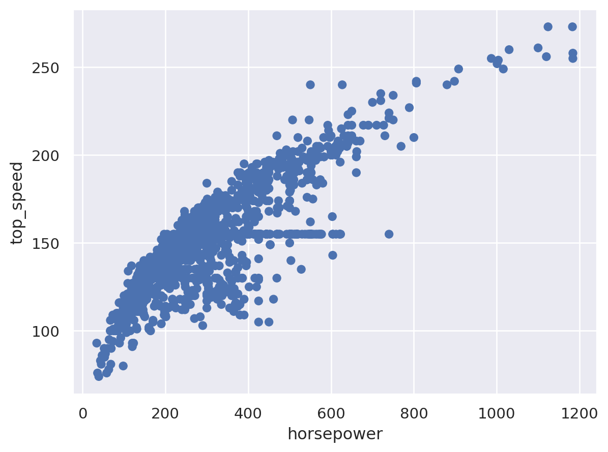
Using Seaborn Objects to create a line chart#
In the next example which is also from sharpsightlabs.com shows how we can use the line mark (so.Line()) to create a line chart of the daily stock price of Amazon share (ticker code “amzn”).
#%% Using Seaborn Objects to create line plot
import seaborn as sns
import seaborn.objects as so
import pandas as pd

# This example is adapted from https://www.sharpsightlabs.com/blog/seaborn-objects-introduction/

# load stock price data for google and amazon over 2000-2020
stocks = pd.read_csv("amzn_goog_2000-01-01_to_2020-12-05.csv")
stocks.date = pd.to_datetime(stocks.date)

# use Pandas' query() method to quickly select rows associated with Amazon stock price
amazon_stock = stocks.query("stock == 'amzn'")

# use seabor objects to create line chart of Amazon stock price

(so.Plot(data = amazon_stock   # specify the dataframe containing the data
         ,x = 'date'           # specify the x axis
         ,y = 'close'          # specify the y axis
         )
   .add(so.Line())             # specify "line" as the marks for the plot (since we want line chart)
 )
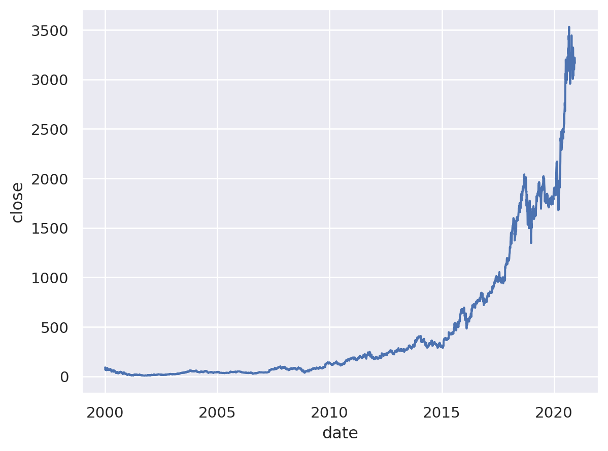
Using SO to create a bar chart#
In the third example, we use the bar marks to create bar chart to compare the bank balance of bank account owners based on the owner’s education level.
#%% Using Seaborn Objects to create bar chart
import seaborn as sns
import seaborn.objects as so
import pandas as pd

# This example is adapted from https://www.sharpsightlabs.com/blog/seaborn-objects-introduction/

# Load bank customer records
bank = pd.read_csv('bank.csv')

(so.Plot(data = bank            # specify the dataframe containing the data
         ,x = 'education'       # specify the x-axis
         ,y = 'balance'         # specify the y-axis
         )
   .add(so.Bar(), so.Agg())     # specify 'bar' as the marks for the plot (since we want bar chart)
 )
Using SO to create a line chart with multiple colour#
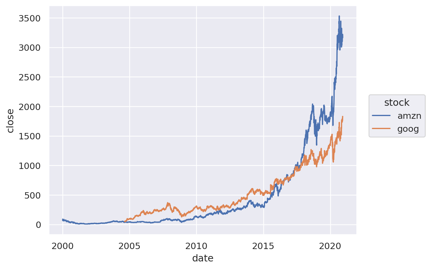
In the fourth example, we still have a single layer chart, but in this case we add a third dimension to the plotted relationship using colour. In this case, we are showing the difference in the trends of Amazon and Google daily stock prices between 2000 and 2021.
#%% Using Seaborn Objects to create line plot with two colors
import seaborn as sns
import seaborn.objects as so
import pandas as pd

# load stock price data for google and amazon over 2000-2020
stocks = pd.read_csv("amzn_goog_2000-01-01_to_2020-12-05.csv")
stocks.date = pd.to_datetime(stocks.date)

# use seabor objects to create line chart of Amazon stock price

(so.Plot(data = stocks   # specify the dataframe containing the data
         ,x = 'date'           # specify the x axis
         ,y = 'close'          # specify the y axis
         ,color = 'stock'
         )
   .add(so.Line())             # specify "line" as the marks for the plot (since we want line chart)
 )
Using SO for multilayer charts#
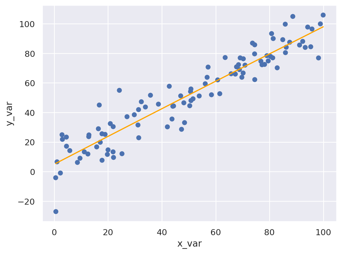
The power and versatility of the Seaborn Objects are apparent when we move from simple single layer chart to more complext multilayer charts as illustrayted in the next example. In this example, we generate and artificial regression data that link \(y_i\) as a function of \(x_i\). Using the data, we create an so.Plot() which contains both a scatter plot and a fitted linear regression. To create the scatter plot, we use the so.Dot() mark and to create the linear regression fitted line we use the so.Line() with two additional parameters: color = 'orange' and so.PolyFit() as the estimation method to fit the regression line.
#%% Using Seaborn Objects to create multilayer scatter and line plots

# This example is adapted from https://anaconda.cloud/seaborn-objects-system

import numpy as np
import seaborn as sns
import seaborn.objects as so
import pandas as pd


# Create artificial scatter plot data

# set seed for random generator (set seed for reproducibility)
np.random.seed(22)
# x is 100 a random draw from uniform[0,100] distribution
x_data = np.random.uniform(low = 0, high = 100, size = 100)

# y data is a regression function of x and normal random error
y_data = x_data + np.random.normal(size = 100, loc = 0, scale = 10)

# x_data and y_data are np arrays, we want to convert them into a DataFrame
point_data = pd.DataFrame({'x_var':x_data
                          ,'y_var':y_data
                          })

# now create the plot
(so.Plot(data = point_data                            #specify the data
         ,x = 'x_var'                                 #specify x axis
         ,y = 'y_var'                                 #specify y axis
         )
    .add(so.Dot())                                    #specify scatter plot
    .add(so.Line(color = 'orange'), so.PolyFit())     #specify a polyfit line
)
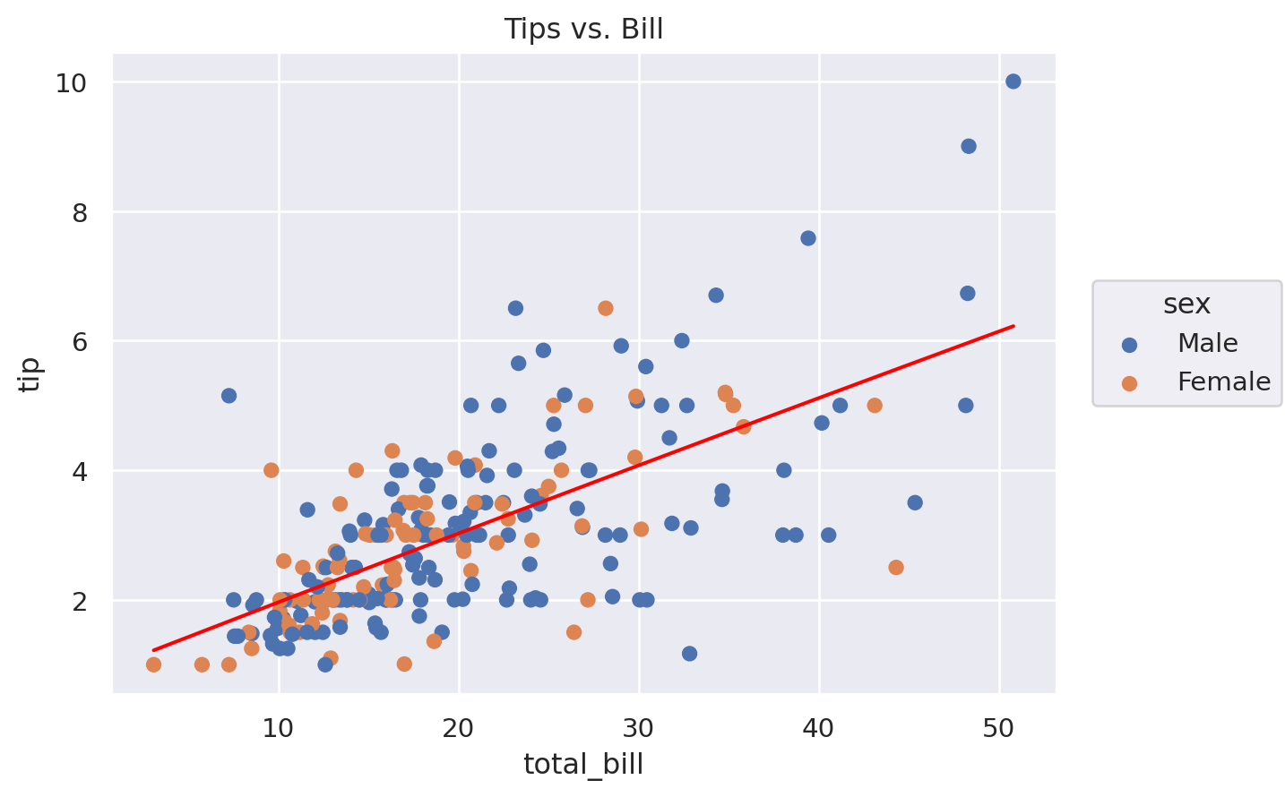
In the example below, we produce a similar multilayer plot containing a scatter plot and fitted regression line, except this time we add colour based on the variable ‘sex’ to distinguish the scatter marks for Male and Female and we add title to plot using the .label() method. Furtheremore, in the example we explicitly assign a name (‘fig’) to the so.Plot() seaborn object we created and we illustrate how the ‘fig’ object is nothing but a Matplotlib figure object and thus we can specify the .show() or the .save() methods to show and save the plot.
#%% Another multi-layer example

# This example is adapted from https://towardsdatascience.com/introducing-seaborn-objects-aa40406acf3d

import numpy as np
import seaborn as sns
import seaborn.objects as so
import pandas as pd

# Load the tips dataset that come with Seaborn module
tips = sns.load_dataset('tips')

tips.head(3)

fig = (so.Plot(data=tips, x='total_bill', y='tip')
       .add(so.Dot(), color='sex')
       .add(so.Line(color='red'), so.PolyFit())
       .label(title='Tips vs. Bill'))

#fig.show()
fig.save('tips.svg')
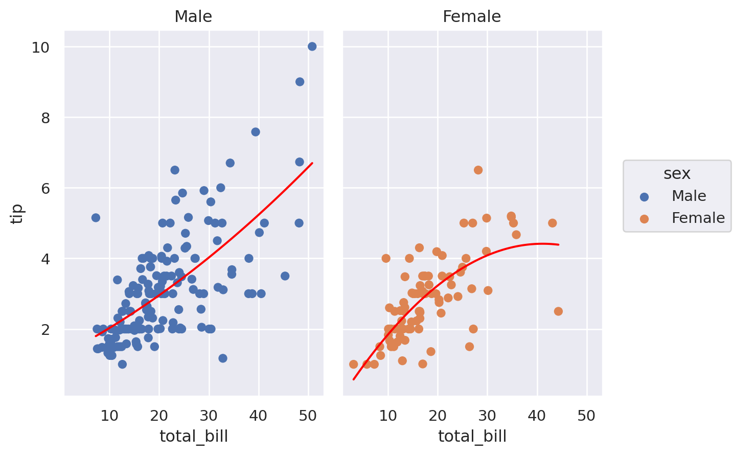
Lastly, we can call the .Facet() to create multilayer subplots with Seaborn Objects with relative ease. This example concludes our discussion of Python Data Visualisation. For more discussions on Seaborn Objects, have a look at the following online websites from which some of our examples were adapted.
https://www.anaconda.com/blog/an-introduction-to-the-seaborn-objects-system
https://cmdlinetips.com/2022/10/seaborn-version-0-12-0-with-ggplot2-like-interface/
https://www.sharpsightlabs.com/blog/seaborn-objects-introduction/
https://seaborn.pydata.org/tutorial/objects_interface.html (behind paywall):
https://towardsdatascience.com/introducing-seaborn-objects-aa40406acf3d
#%% Using SO to create Multi-layer faceted charts

# This example is adapted from https://towardsdatascience.com/introducing-seaborn-objects-aa40406acf3d

import numpy as np
import seaborn as sns
import seaborn.objects as so
import pandas as pd

# Load the tips dataset that come with Seaborn module
tips = sns.load_dataset('tips')

fig = (so.Plot(tips, 'total_bill', 'tip')
       .add(so.Dot(), color='sex')
       .add(so.Line(color='red'), so.PolyFit()))
fig2 = fig.facet(col="sex")
fig2.save('tipsbysex.svg')

# alternatively, we issue facet function directly
fig3 = (so.Plot(tips, 'total_bill', 'tip')
       .add(so.Dot(), color='sex')
       .add(so.Line(color='red'), so.PolyFit())
       .facet(col="sex")
       )
fig3.save('tipsbysex-fig3.svg')